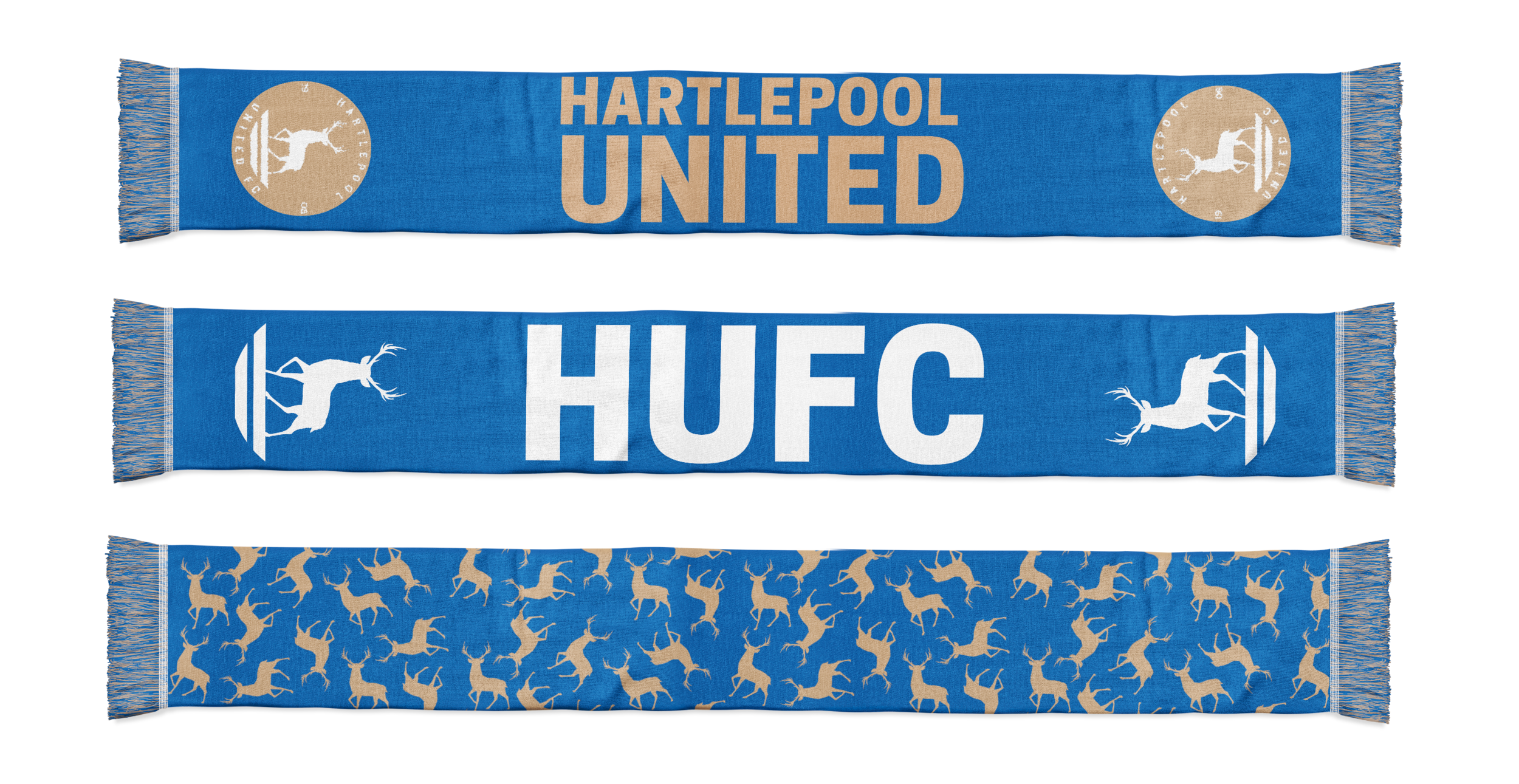
hartlepool united official club crest and branding
Hartlepool United FC is a football club in the north east of England. After having their Ship's Wheel badge for a little over 20 years they decided to rebrand the club for the modern age by taking the club and town's history and commercial considerations into account.
The Ship’s Wheel crest’s intricate design made it impractical to use, particularly at small sizes. It was designed in 1995 before digital and social media became the norm and does not replicate well in many online media and printed items. It’s difficult and expensive to produce and the original design is misaligned.
The brief was to create a modern, iconic and flexible badge that could be used across a range of platforms.
This new club crest debuted in the 2017/18 season.
Hartlepool United FC Crest History

Over the course of a year we have researched the club and town’s history, talked with fans in person, engaged the wider fan base online and engaged with commercial partners to take all views into account.
Changing the club’s badge is a big decision and, although some were very connected to the Ship's Wheel badge, most were not and welcomed a change.
Taking all of the varying opinions into account produced two clear themes that were integral to the new design: a return to the stag or ‘hart’ traditionally linked with Hartlepool and, 1908, the year of formation.
A smaller but significant number wanted the town’s maritime history and also – somewhat divisively – the monkey legend represented.

The new badge is constructed using a new colour in the Hartlepool United FC palette, developed to reflect the limestone heritage of the town and suggestive of the ambition of the football club:
Hartlepool Limestone Gold
The colour references the limestone town wall on the headland. Built in the 14th Century, it made Hartlepool one of the most fortified port towns and the only walled town without a castle in England.
The land on which Victoria Park sits was originally owned by the North Eastern Railway Company to be used as a limestone quarry.
Hartlepool’s iconic St. Hilda’s church is also built from limestone. The colour is based on the sun reflecting on the wall.
This design solves all of the technical issues that the club faces with the Ship's Wheel badge and encompasses the widest range of opinions offered by fans and partners without compromising it’s aesthetic.
The design is flexible - meaning the colour can be changed, the design reversed or elements removed to suit different purposes – but it is anchored in the new Hartlepool Limestone Gold colour. The Shield has no trim which means it can be positioned as its own circular shape – like a single fragment of limestone – or blended with its background – as if that one piece of stone is now part of a larger and more solid structure. Part of the wall.
The classic ‘hart’ and ‘pool’ motif is designed to reflect the town's heritage with the stag’s position reversed to reference the club's crest from the 1970’s. The water is simplified and, especially when the badge is coloured blue, now includes a subtle nod to the monkey legend as the water becomes Breton Stripes: the historic and official uniform of the French Navy.
The typeface has been designed to contain some of the same elements as the type on the HMS Trincomalee as a reference to the town’s marina and maritime heritage.